

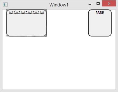
<Color x:Key="DefaultColor" A="255" R="240" G ="240" B="240"/>
<Color x:Key="HighlightColor" A="255" R="229" G ="229" B="229"/>
<Color x:Key="PressedColor" A="255" R="215" G ="215" B="215"/>
<SolidColorBrush x:Key="DefaultBrush" Color="{StaticResource DefaultColor}" />
<SolidColorBrush x:Key="HighlightBrush" Color="{StaticResource HighlightColor}" />
<SolidColorBrush x:Key="PressedBrush" Color="{StaticResource PressedColor}" />
<Style TargetType="Button">
<Setter Property="OverridesDefaultStyle" Value="True" />
<Setter Property="Background" Value="{StaticResource DefaultBrush}" />
<Setter Property="BorderThickness" Value="2" />
<Setter Property="BorderBrush" Value="Black" />
<Setter Property="Template">
<Setter.Value>
<ControlTemplate TargetType="Button">
<Border BorderThickness="{TemplateBinding BorderThickness}"
BorderBrush="{TemplateBinding BorderBrush}"
Background="{TemplateBinding Background}"
Padding="{TemplateBinding Padding}"
CornerRadius="10">
<ContentControl Content="{TemplateBinding Content}" HorizontalAlignment="Center" />
</Border>
</ControlTemplate>
</Setter.Value>
</Setter>
<Style.Triggers>
<Trigger Property="IsMouseOver" Value="True">
<Setter Property="Background" Value="{StaticResource HighlightBrush}" />
</Trigger>
<Trigger Property="IsPressed" Value="True">
<Setter Property="Background" Value="{StaticResource PressedBrush}" />
</Trigger>
</Style.Triggers>
</Style>
Combobox flat style
<ControlTemplate x:Key="ComboBoxToggleButton" TargetType="{x:Type ToggleButton}">
<Grid>
<Grid.ColumnDefinitions>
<ColumnDefinition />
<ColumnDefinition Width="20" />
</Grid.ColumnDefinitions>
<Border
x:Name="Border"
Grid.ColumnSpan="2"
CornerRadius="2"
Background="#C0C0C0"
BorderBrush="#404040"
BorderThickness="1" />
<Border
Grid.Column="0"
CornerRadius="2,0,0,2"
Margin="1"
Background="#FFFFFF"
BorderBrush="#404040"
BorderThickness="0,0,1,0" />
<Path
x:Name="Arrow"
Grid.Column="1"
Fill="#404040"
HorizontalAlignment="Center"
VerticalAlignment="Center"
Data="M 0 0 L 4 4 L 8 0 Z"/>
</Grid>
<ControlTemplate.Triggers>
<Trigger Property="ToggleButton.IsMouseOver" Value="true">
<Setter TargetName="Border" Property="Background" Value="#808080" />
</Trigger>
<Trigger Property="ToggleButton.IsChecked" Value="true">
<Setter TargetName="Border" Property="Background" Value="#E0E0E0" />
</Trigger>
<Trigger Property="IsEnabled" Value="False">
<Setter TargetName="Border" Property="Background" Value="#EEEEEE" />
<Setter TargetName="Border" Property="BorderBrush" Value="#AAAAAA" />
<Setter Property="Foreground" Value="#888888"/>
<Setter TargetName="Arrow" Property="Fill" Value="#888888" />
</Trigger>
</ControlTemplate.Triggers>
</ControlTemplate>
<ControlTemplate x:Key="ComboBoxTextBox" TargetType="{x:Type TextBox}">
<Border x:Name="PART_ContentHost" Focusable="False" Background="{TemplateBinding Background}" />
</ControlTemplate>
<Style TargetType="{x:Type ComboBox}">
<Setter Property="SnapsToDevicePixels" Value="true"/>
<Setter Property="OverridesDefaultStyle" Value="true"/>
<Setter Property="ScrollViewer.HorizontalScrollBarVisibility" Value="Auto"/>
<Setter Property="ScrollViewer.VerticalScrollBarVisibility" Value="Auto"/>
<Setter Property="ScrollViewer.CanContentScroll" Value="true"/>
<Setter Property="MinWidth" Value="120"/>
<Setter Property="MinHeight" Value="20"/>
<Setter Property="Template">
<Setter.Value>
<ControlTemplate TargetType="{x:Type ComboBox}">
<Grid>
<ToggleButton
Name="ToggleButton"
Template="{StaticResource ComboBoxToggleButton}"
Grid.Column="2"
Focusable="false"
IsChecked="{Binding Path=IsDropDownOpen,Mode=TwoWay,RelativeSource={RelativeSource TemplatedParent}}"
ClickMode="Press">
</ToggleButton>
<ContentPresenter
Name="ContentSite"
IsHitTestVisible="False"
Content="{TemplateBinding SelectionBoxItem}"
ContentTemplate="{TemplateBinding SelectionBoxItemTemplate}"
ContentTemplateSelector="{TemplateBinding ItemTemplateSelector}"
Margin="3,3,23,3"
VerticalAlignment="Center"
HorizontalAlignment="Left" />
<TextBox x:Name="PART_EditableTextBox"
Style="{x:Null}"
Template="{StaticResource ComboBoxTextBox}"
HorizontalAlignment="Left"
VerticalAlignment="Center"
Margin="3,3,23,3"
Focusable="True"
Background="Transparent"
Visibility="Hidden"
IsReadOnly="{TemplateBinding IsReadOnly}"/>
<Popup
Name="Popup"
Placement="Bottom"
IsOpen="{TemplateBinding IsDropDownOpen}"
AllowsTransparency="True"
Focusable="False"
PopupAnimation="Slide">
<Grid
Name="DropDown"
SnapsToDevicePixels="True"
MinWidth="{TemplateBinding ActualWidth}"
MaxHeight="{TemplateBinding MaxDropDownHeight}">
<Border
x:Name="DropDownBorder"
Background="#FFFFFF"
BorderThickness="1"
BorderBrush="#888888"/>
<ScrollViewer Margin="4,6,4,6" SnapsToDevicePixels="True">
<StackPanel IsItemsHost="True" KeyboardNavigation.DirectionalNavigation="Contained" />
</ScrollViewer>
</Grid>
</Popup>
</Grid>
<ControlTemplate.Triggers>
<Trigger Property="HasItems" Value="false">
<Setter TargetName="DropDownBorder" Property="MinHeight" Value="95"/>
</Trigger>
<Trigger Property="IsEnabled" Value="false">
<Setter Property="Foreground" Value="#888888"/>
</Trigger>
<Trigger Property="IsGrouping" Value="true">
<Setter Property="ScrollViewer.CanContentScroll" Value="false"/>
</Trigger>
<Trigger SourceName="Popup" Property="Popup.AllowsTransparency" Value="true">
<Setter TargetName="DropDownBorder" Property="CornerRadius" Value="4"/>
<Setter TargetName="DropDownBorder" Property="Margin" Value="0,2,0,0"/>
</Trigger>
<Trigger Property="IsEditable"
Value="true">
<Setter Property="IsTabStop" Value="false"/>
<Setter TargetName="PART_EditableTextBox" Property="Visibility" Value="Visible"/>
<Setter TargetName="ContentSite" Property="Visibility" Value="Hidden"/>
</Trigger>
</ControlTemplate.Triggers>
</ControlTemplate>
</Setter.Value>
</Setter>
<Style.Triggers>
</Style.Triggers>
</Style>